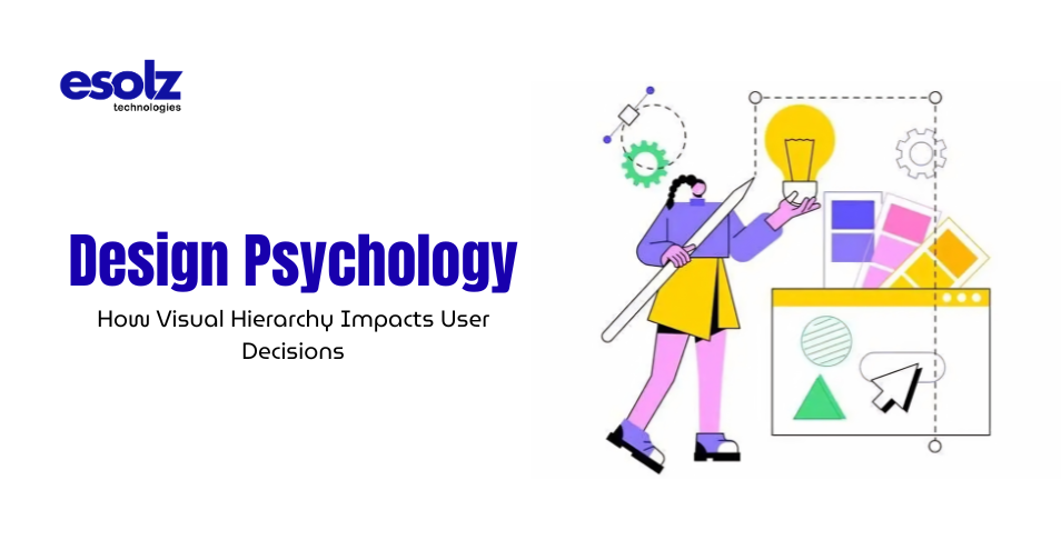
Design psychology is more than just choosing colors and fonts; it’s about understanding how users think, behave, and make decisions when interacting with a website. Every visual element, from the size of a headline to the placement of a button, influences how users perceive information and take action. Research suggests that users judge a website in just 0.05 seconds. This means your design must instantly communicate clarity, trust, and purpose. When done right, visual hierarchy becomes a silent guide, leading users exactly where you want them to go.
What Is Visual Hierarchy and Why Does It Matter
Visual hierarchy refers to the arrangement of design elements in a way that signals importance. It ensures that users notice the most critical information first and naturally flow through the rest of the content. A well-structured hierarchy can increase user engagement by over 40%, while poor design can cause nearly 38% of users to stop interacting altogether. This highlights how crucial it is to prioritize elements effectively. For brands aiming to stand out in a competitive digital landscape, mastering this concept is what often separates an average website from one created by the best design agency.
The Role of First Impressions in User Decisions
First impressions in digital experiences are formed within seconds, and they often determine whether users stay or leave. The way information is visually presented plays a critical role in shaping these decisions. By understanding how users interact with design at first glance, you can create a more engaging and intuitive experience that encourages deeper exploration.
Why Users Scan Instead of Read
When users land on a website, they rarely read every word. Instead, they scan the page to quickly determine whether the content is relevant to their needs. This behavior is driven by limited attention spans and the overwhelming amount of information available online. Research indicates that most users spend just a few seconds deciding whether to stay or leave, making those initial moments incredibly critical.
Eye-tracking studies reveal that users typically follow predictable scanning patterns, such as the F-pattern for content-heavy pages and the Z-pattern for visually structured layouts. These patterns highlight the importance of placing key information—like headlines, value propositions, and calls to action—exactly where users are most likely to look first.
Aligning Design with Natural User Behavior
When a website’s design aligns with these natural scanning behaviors, it creates a seamless experience. Users can effortlessly locate important information without feeling lost or overwhelmed. This intuitive navigation builds confidence and encourages deeper interaction. On the other hand, if the layout disrupts these patterns—by placing critical elements in unexpected areas or cluttering the interface—users may struggle to find what they need. This confusion often leads to frustration and, ultimately, higher bounce rates. A well-thought-out visual structure ensures that users feel guided rather than challenged.
Creating a Strong and Lasting First Impression
First impressions are formed almost instantly, and design plays a major role in shaping them. A clear, bold headline immediately communicates purpose, while compelling visuals capture attention and evoke emotion. Strategic spacing ensures that the page feels organized and easy to navigate. These elements work together to create a sense of professionalism and trust. When users feel confident in what they see, they are more likely to continue exploring. This is why a top website design company prioritizes visual structure early in the design process—ensuring that every element contributes to a cohesive and impactful first impression.
Key Elements That Shape Visual Hierarchy
Visual hierarchy is built through a combination of design elements that work together to guide user attention. Each element plays a specific role in influencing how users perceive and interact with content. When these elements are used strategically, they create a clear and intuitive pathway that enhances user experience and drives meaningful actions.
Size and Scale: Guiding Attention Naturally
Size is one of the most powerful tools in visual hierarchy. Larger elements naturally draw the eye, making them ideal for highlighting key messages such as headlines or primary offers. By contrast, smaller elements are used for supporting information, creating a clear distinction between what is most important and what is secondary. This variation in scale allows users to quickly understand the structure of the content without having to read everything. It creates a visual roadmap that guides them through the page in a logical and engaging way.
Color and Contrast: Directing Focus with Precision
Color and contrast play a crucial role in capturing attention and guiding user behavior. Bright or contrasting colors naturally stand out against neutral backgrounds, making them perfect for highlighting important elements like call-to-action buttons. When used strategically, color can influence decision-making by drawing attention to specific actions. For example, a well-designed button that contrasts with the rest of the page can significantly improve click-through rates. However, balance is key—overusing bold colors can reduce their effectiveness and create visual clutter.
Typography: Enhancing Readability and Structure
Typography is more than just choosing a font—it’s about creating a clear and consistent reading experience. Different font sizes, weights, and styles help establish a hierarchy that distinguishes between headings, subheadings, and body text. A well-structured typographic system ensures that users can quickly scan and understand the content. It also reinforces brand identity and tone, making the overall experience more cohesive and engaging.
Spacing and Alignment: Creating Clarity Through Simplicity
Spacing, often referred to as white space, is a critical yet often underestimated design element. It provides breathing room between elements, making the content easier to read and navigate. Proper alignment further enhances this clarity by organizing content in a structured and predictable way. Together, spacing and alignment reduce cognitive load, allowing users to focus on the message rather than struggling with the layout. This simplicity leads to better comprehension and a more enjoyable user experience.
Positioning: Placing Elements Where They Matter Most
Where elements are placed on a page significantly impacts their visibility and effectiveness. Content positioned at the top or center of the screen naturally receives more attention, making these areas ideal for key messages and calls to action. Strategic positioning ensures that users encounter important information at the right time in their journey. By guiding their attention through deliberate placement, you can create a smooth and intuitive flow that encourages engagement and action.
How Visual Hierarchy Drives Conversions
Visual hierarchy is not just about organizing content—it’s about influencing decisions. When users land on a page, they subconsciously look for direction. A well-structured design provides that direction by guiding them toward the most important actions without confusion or hesitation. This clarity plays a crucial role in turning visitors into active users.
Design Psychology: Turning Attention into Action
A well-designed hierarchy doesn’t just look appealing—it actively drives user behavior. When users can instantly understand what to do next, they are far more likely to engage. Clear pathways, highlighted elements, and intuitive flow remove friction from the decision-making process. For instance, when a call-to-action button is prominently placed, uses contrasting colors, and communicates a clear message, it becomes almost impossible to ignore. This strategic positioning encourages users to take action naturally rather than forcing them to search for the next step.
Design Psychology: The Measurable Impact on Conversions
Websites that effectively use visual hierarchy often see significant improvements in performance. Conversion rates can increase by 30% or more when key elements are optimized for visibility and clarity. This is because users don’t feel lost—they feel guided. Every design choice, from layout to color contrast, contributes to how easily users can move through the conversion funnel. When the journey is smooth and intuitive, users are more likely to complete desired actions, whether it’s signing up, making a purchase, or exploring further.
Design Psychology: Beyond Aesthetics: A Strategic Investment
Investing in design psychology goes far beyond making a website look good. It directly impacts how users interact with your brand and how effectively your platform achieves its goals. A visually structured design ensures that every element serves a purpose, ultimately driving better outcomes and stronger engagement.
The Emotional Impact of Design Choices
Design is not just functional—it’s emotional. Every visual element on a page has the power to influence how users feel, and those feelings play a major role in decision-making. A thoughtfully designed interface can build trust, create comfort, and encourage users to take action without hesitation.
How Design Triggers Emotional Responses
Colors, shapes, and layouts work together to create subconscious reactions. For example, softer tones and balanced layouts often evoke a sense of calm and trust, while harsh contrasts or cluttered designs can create tension and confusion. These emotional triggers happen instantly, often before users even begin to process the content. This is why design choices must be intentional, ensuring that the overall experience aligns with the message you want to convey.
Building Trust Through Visual Simplicity
Clean and minimal designs are often associated with professionalism and reliability. They make it easier for users to focus on what matters, reducing distractions and creating a sense of order. On the other hand, cluttered layouts can overwhelm users, making them question the credibility of the platform. In fact, a large percentage of users judge a company’s trustworthiness based solely on its website design. This makes visual clarity and consistency essential for establishing a positive perception.
Reinforcing Confidence with Structured Design
A well-defined visual hierarchy reassures users by providing a clear and predictable experience. When users know where to look and what to expect, they feel more confident in their interactions. This confidence is key to encouraging action. Whether it’s clicking a button, filling out a form, or exploring further, users are more likely to proceed when the design feels intuitive and trustworthy. Ultimately, emotional comfort combined with visual clarity creates a powerful foundation for better user decisions.
Common Mistakes That Disrupt Visual Hierarchy
Even the most valuable content can fail to deliver results if it is not presented effectively. Visual hierarchy plays a crucial role in ensuring that users can navigate and understand information with ease. When design elements are misused or overlooked, the entire user experience suffers, leading to confusion and disengagement.
Overloading Content and Creating Clutter
One of the most common mistakes is trying to present too much information at once. When a page is overloaded with text, images, and multiple calls to action, users struggle to identify what truly matters. This clutter creates cognitive overload, making it difficult for users to focus or take action. Simplifying content and prioritizing key messages allows users to process information more efficiently and stay engaged.
Inconsistent Design Elements
Using different fonts, colors, or styles without a clear system disrupts the visual flow of a website. Poor visual consistency makes the interface feel unstructured and unprofessional, which can negatively impact user trust. A consistent design language helps users quickly understand how to navigate the page and where to find important information, creating a smoother and more intuitive experience.
Poor Contrast and Weak Visibility
When there is not enough contrast between elements, important content can easily go unnoticed. For example, a call-to-action button that blends into the background will fail to capture attention. Strong contrast ensures that key elements stand out, guiding users toward the actions you want them to take.
Ineffective Use of Spacing
Spacing is essential for readability and clarity. Without adequate white space, content appears cramped and overwhelming. Users may find it difficult to scan the page, leading to frustration and higher bounce rates. Proper spacing creates a sense of balance, allowing each element to breathe and improving overall comprehension.
Lack of Clear Focus on Key Actions
Failing to highlight primary actions is another critical mistake. When users are unsure about what to do next, they are less likely to engage. Every page should have a clear focal point that directs users toward a specific goal. Avoiding these common mistakes is essential for building a seamless and engaging user experience that keeps visitors interested and encourages interaction.
Design Psychology: Aligning Visual Hierarchy with User Intent
A successful design is one that understands and responds to user intent. Every visitor arrives with a purpose—whether it’s to gather information, explore services, or make a decision. Visual hierarchy should act as a guide, helping users achieve their goals quickly and effortlessly.
Design Psychology: Understanding What Users Are Looking For
The first step in aligning design with user intent is identifying what users expect from your website. This could vary depending on their stage in the journey, but the goal remains the same—to provide clarity and direction. When users can immediately recognize that your website meets their needs, they are more likely to stay and explore further.
Design Psychology: Creating a Clear and Intuitive Navigation Flow
Navigation plays a vital role in guiding users through your website. Well-structured menus, clearly labeled sections, and logical content organization make it easy for users to find what they need. Highlighted sections and strategically placed elements ensure that users don’t have to search for important information. Instead, they are naturally led from one step to the next.
Design Psychology: Reducing Friction in the User Journey
When users don’t have to think too much, they are more likely to engage. A clean and intuitive layout minimizes effort, allowing users to focus on their goals rather than figuring out how the website works. This seamless experience not only improves user satisfaction but also increases the likelihood of conversions and long-term engagement.
Design Psychology: Building a High-Performing Website Through Alignment
The alignment between user intent and visual hierarchy is what defines a high-performing website. When design elements are strategically arranged to support user goals, the entire experience becomes more effective and impactful.
Why Strategic Design Is a Competitive Advantage
In today’s highly competitive digital landscape, design is no longer optional—it’s a key differentiator. Users have countless options available, and the way your website presents itself often determines whether they stay or move on.
Standing Out in a Crowded Market
A strong visual hierarchy helps your website capture attention instantly. By organizing content in a clear and visually appealing way, you can communicate your value within seconds. This immediate clarity sets you apart from competitors who may have similar offerings but lack effective presentation.
Retaining Attention and Building Trust
Attracting users is only the first step—retaining them is equally important. Websites with a well-structured design keep users engaged by guiding them through content in a meaningful way. This structured experience builds trust, as users feel confident navigating a platform that is easy to understand and interact with.
Driving Meaningful User Actions
Strategic design ensures that users are not just browsing but also taking action. Whether it’s clicking a button, filling out a form, or exploring services, a clear visual hierarchy leads users toward these outcomes naturally.
The Value of Professional Design Expertise
This is where working with the most recommended website design company can make a measurable difference. Professional expertise ensures that every design decision is intentional, from layout and color to typography and spacing. By leveraging design psychology and visual hierarchy effectively, businesses can create websites that not only look impressive but also deliver real, measurable results.
Summing Up
Design psychology is not just a creative discipline; it’s a business tool. Visual hierarchy plays a critical role in shaping how users interact, perceive, and ultimately decide. When every element on your website has a purpose and a place, users move seamlessly from curiosity to action. That’s the true impact of thoughtful design; it not only looks appealing, but delivers results. By prioritizing clarity, structure, and user behavior, you create an experience that naturally leads to better engagement, stronger trust, and higher conversions.